Work / Designation
Metis: bringing insurance premium financing online
Metis moved a premium finance company's business from paper, fax, and in-person deal-making to a digital platform for issuing, negotiating, and signing financing contracts. In its first month, the brokerage sent 75 contracts and about half came back signed, against roughly 2 signed contracts a month before. It was my first engagement as lead UX designer.
- Role
- Founder and Lead UX Designer, Designation
- Team
- Three developers
- Built with
- React Native and our own e-signature
- Outcome
- ~2 → ~35 signed contracts a month
The ask
The client came to us after a cold call, looking for a new WordPress website. As we learned the business, it became clear the real constraint wasn't the website: it was a sales process that gave brokers little reason to close more than a handful of contracts. The engagement grew into a product, a digital way to issue, negotiate, and sign financing contracts.
My role
I also acted as account executive, working with the same three developers who later built Myi. It was our largest contract to date, in a domain none of us knew, so we treated it as a paid opportunity to learn and brought in outside experts where we needed them.
The challenge
- A lucrative model with little urgency. The company paid an insured business's full premium up front, and the insured repaid it monthly at a fixed rate plus interest, much like a mortgage. For risk-heavy assets such as ethanol plants, premiums ran into the millions, and the broker's 1% commission on a single contract could carry them for three to four months. Most closed only four or five a year, while the company had capacity to finance far more.
- An analog, relationship-driven process. Sales ran through an external brokerage, on paper, by fax, and in person, often built around expensive client dinners. Contracts sat on desks waiting for someone to chase them.
- Misaligned incentives. Brokers, insureds, and the lender each wanted something different from a deal, and nothing in the process brought them together.
- New territory for the studio. Insurance financing, e-signatures, and React Native were all new to us.
Learning the business
I shadowed brokers, studied contracts in progress, and held long working sessions with the company's owner to understand how the business expected to profit from financing, rather than simply buying and selling debt. Then I mapped what each party wanted from a deal: the broker's commission, the insured's cash flow, and the lender's risk. It was my first time running focus groups, task-based usability tests, A/B tests, and heuristic evaluations.
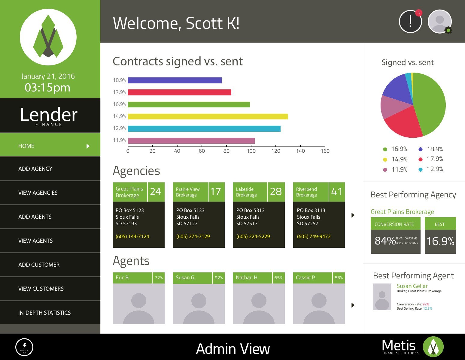
What came out of it was a cast of four: the lender's administrators, the brokerages, the agents who worked for them, and the customers who signed. Each needed a different view of the same contracts.
One contract, one form
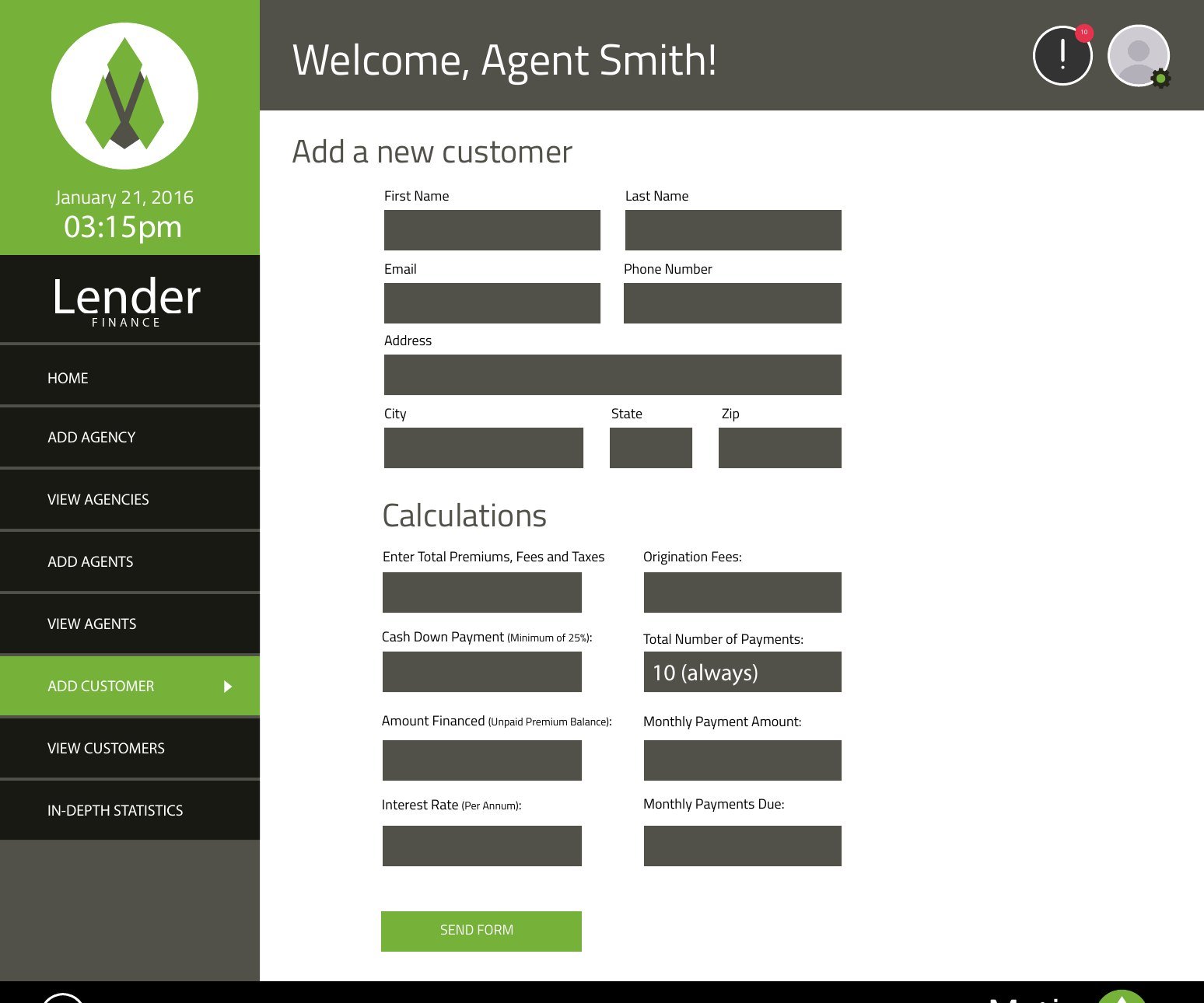
The heart of the product was the financing agreement itself. I redesigned the paper contract as a single form that the whole deal could live in: the payment schedule, the borrower's details, the bank authorization for monthly payments, and signatures for both the agent and the customer.
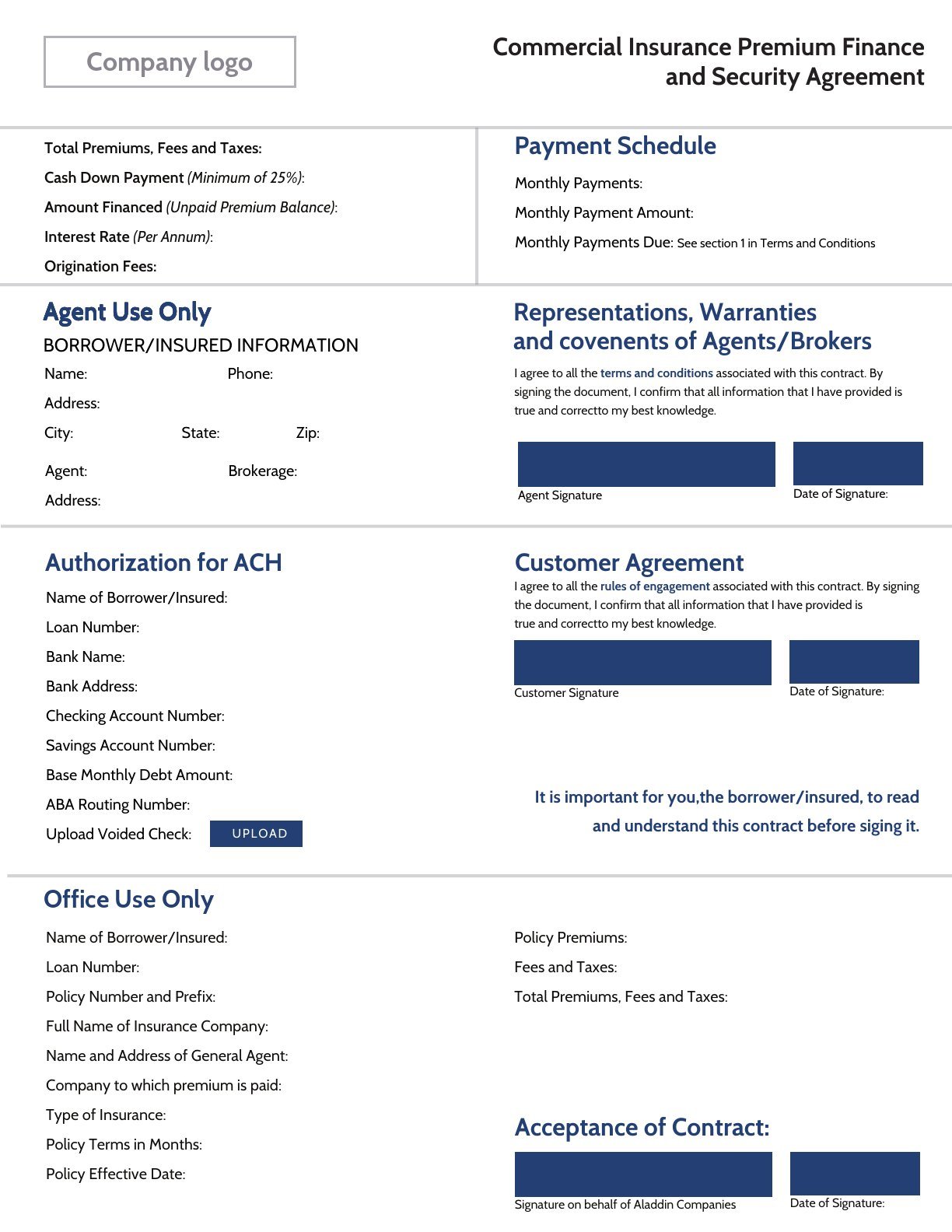
- Negotiation built in. Insureds and the lender could negotiate terms within the contract itself, replacing rounds of faxes and meetings.
- Our own e-signature. In 2014, DocuSign dominated the market and its pricing tiers didn't fit a product of this size. My team built our own signing flow, including the certificate handling, which taught me to speak fluently with developers.
Four roles, one platform
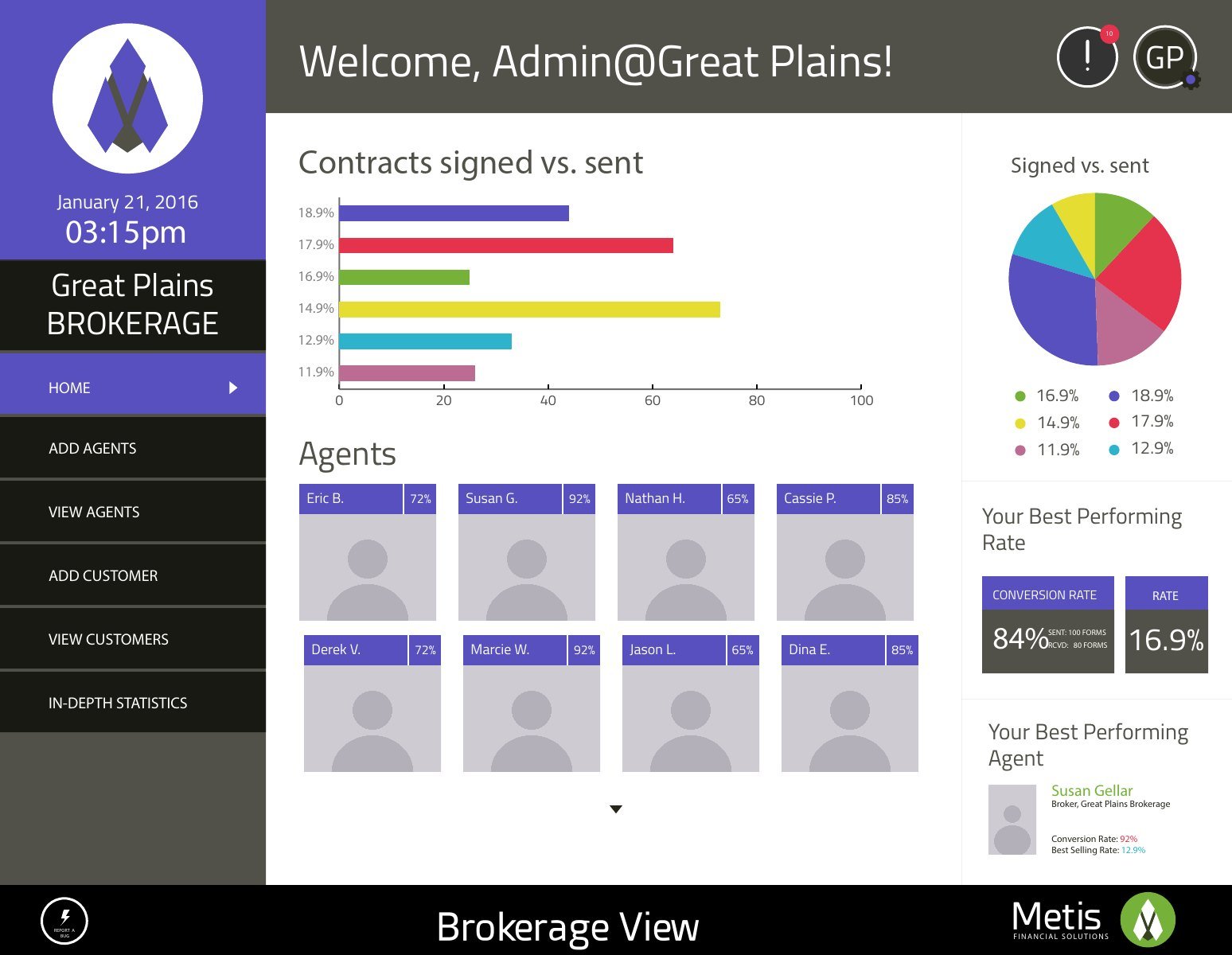
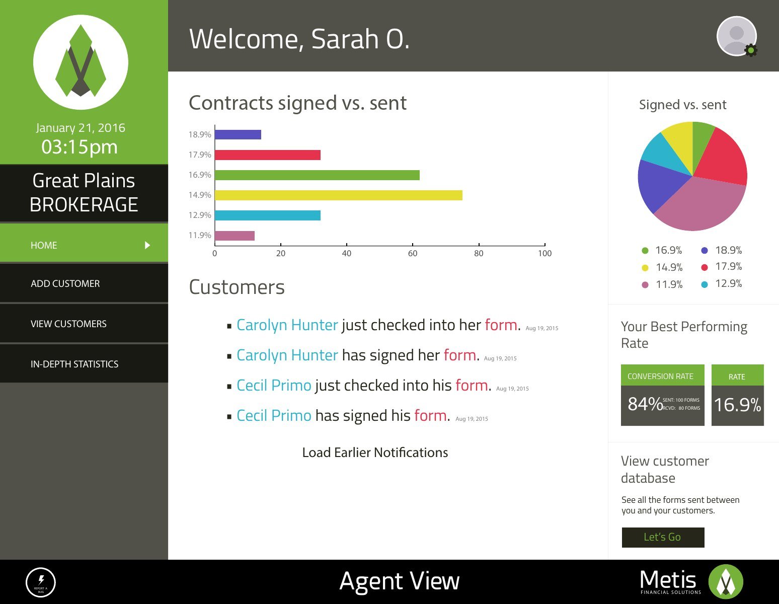
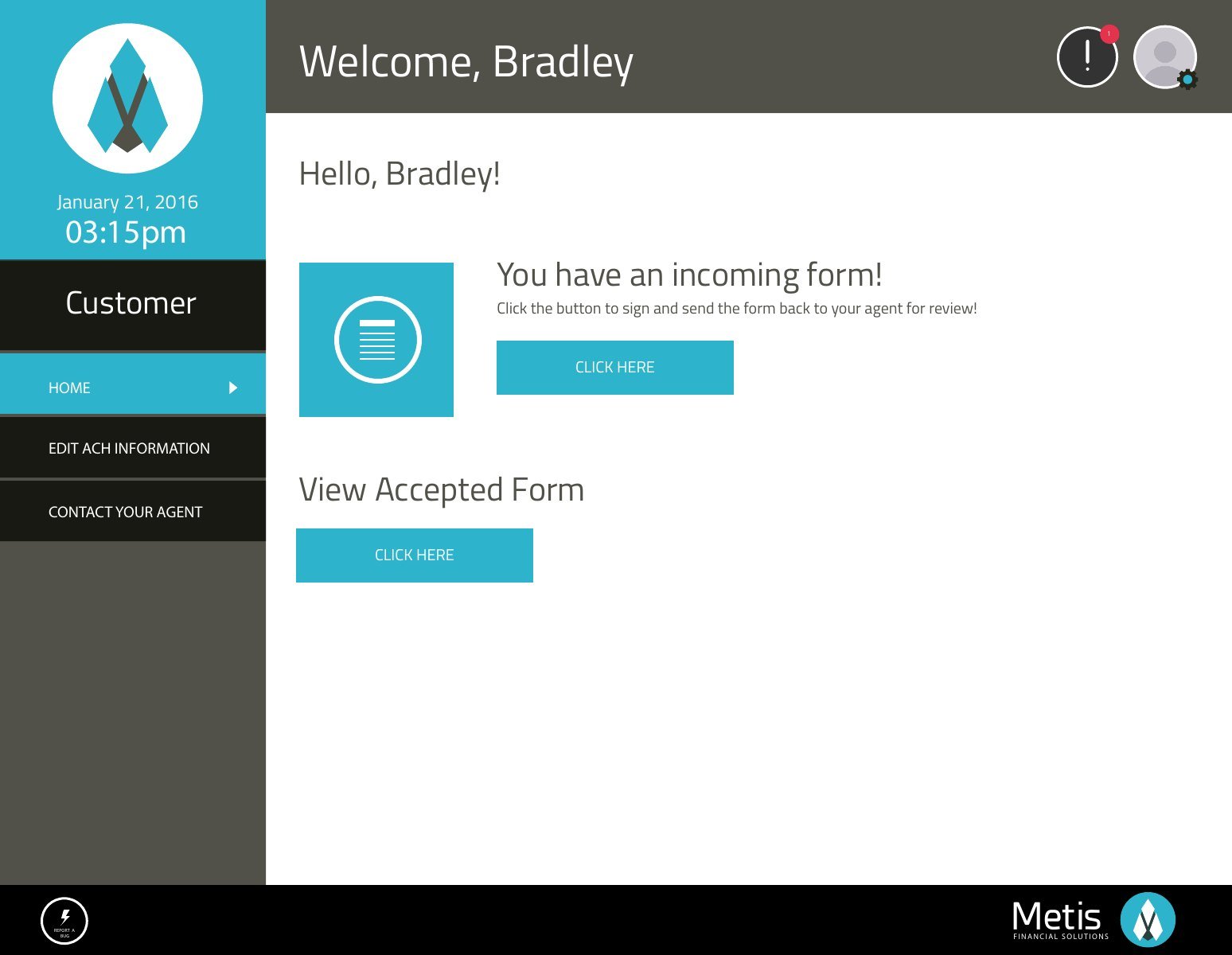
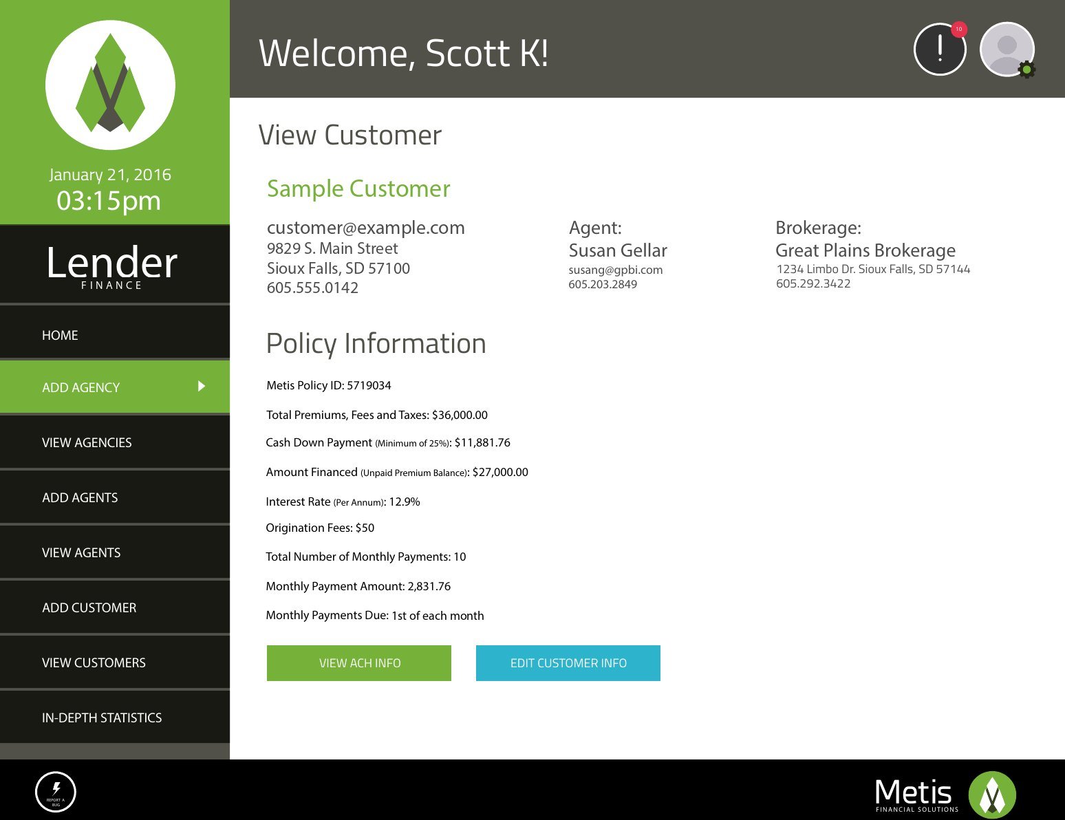
Everyone started from the same door and chose who they were. Each role's sign-in got its own color from the brand palette, so people knew at once which door they were walking through: red for the lender's administrators, yellow for brokerages, teal for agents, and green for customers.
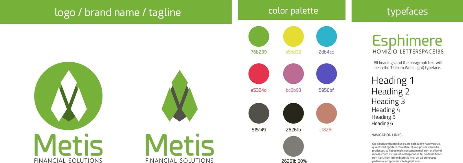
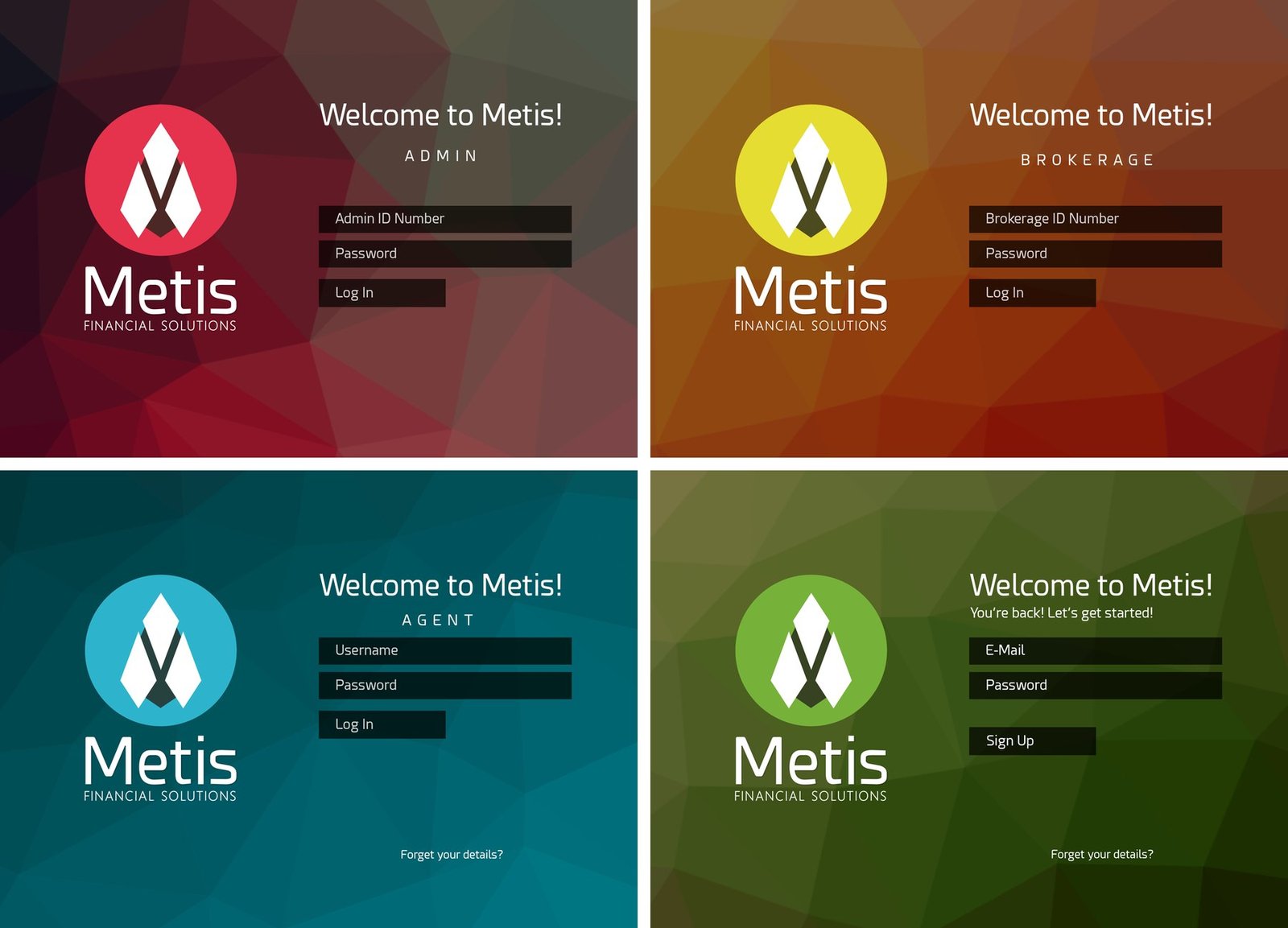
Behind each door, the dashboard answered the question that role cared about most. Every view led with the same measure, contracts signed against contracts sent, so the lender, the brokerage and the agent were finally looking at the same number.
Momentum by design
The product's job was to keep a contract moving once it was sent. A notification cadence reminded customers to sign, so contracts kept moving without a broker having to chase them. The agent saw each step as it happened: a customer opening the form, then signing it.
The turning point
A broker received four signed contracts in a single month, without following up once after the first reminder went out. The reminders were doing the follow-up for him, and the product was closing deals on its own.
Outcomes
- 75 contracts
- sent by the brokerage in the first month after launch
- About half
- came back signed, against about 2 signed contracts a month before
The build shipped smoothly, with no significant technical setbacks. By the time I left Sioux Falls in 2016, the company was moving into a much larger office in a more prominent location. The client later shared that they had approached Marsh McLennan, with a strong possibility of Metis being incorporated.
What I learned
Support the conversation; don't replace it. Our first MVP calculated rates automatically. We removed it in the second iteration: pricing was still a personal conversation between the signatory and the lender, and the product needed to support that conversation, not replace it.

Measure from day one. We didn't yet know how to instrument adoption metrics, so we relied mostly on qualitative feedback. The product was simple; running the project was not, and I learned project management and agile delivery on the fly.
Say yes, learn it, do it. Taking on work we had never done before, in a field as unglamorous as insurance premium financing, became some of the most rewarding work of my career. Understanding the incentives behind a financial product later shaped my work leading the redesign of Chase's loan repayment portal.