Work / Comcast
Comcast's construction finance platform
Over six years, I helped evolve a developer-built Salesforce tool that people used out of necessity into a React platform that serves more than 115,000 employees, contractors, and vendors, and tracks over $3B in construction invoices.
- Role
- Senior Information Architect / Senior UX Designer
- Team
- Sole designer for three years, then managing three designers
- When
- Oct 2019 – Jul 2025
- Stakeholders
- 60+ senior leaders across three divisions and headquarters
The ask
Leadership recognized that the platform had stalled. Adoption hadn't grown beyond the people required to use it, satisfaction scores were flat, and costs rose with each new feature. My interview included a walkthrough of the platform from a first-time user's perspective, identifying where it was hard to use. Once I joined, the goal was to make it a tool people would choose to use.
My role
I led UX and information architecture across the platform, working with 60+ senior leaders across three divisions and headquarters. I was the sole designer for three years, then managed three designers as the team grew.
The challenge
A team of Salesforce developers had built the original app after an earlier version fell short, with the priority on getting core processes working. User experience hadn't yet been a focus.
- Easy mistakes
- Similar-looking jobs in separate tabs made it easy to enter data in the wrong place, and managers sometimes acted on outdated change orders.
- Rising costs
- Every new feature needed more Salesforce development, and every new user needed another license.
- Low confidence
- Many teams kept their own spreadsheets, and one division had funded a separate app of its own.
Start light, then rebuild
We started small and built confidence. The first release was a read-only job tracker for people who needed visibility without entering data. It reached 8,000 users and became the foundation for everything that followed.
The launch was met with real enthusiasm. The read-only views and span replacement were early hits, adoption climbed quickly, and satisfaction scores were high. The only detractors were people who hadn't realized it worked on their phones too; once they found out, they became promoters.
Three months into the rebuild, the work was running into the same difficulties as the earlier version. I recommended moving from Angular to React with Material UI, and leadership agreed. The wider ecosystem and ready-made components cut both build time and cost, and made a shared design system possible.
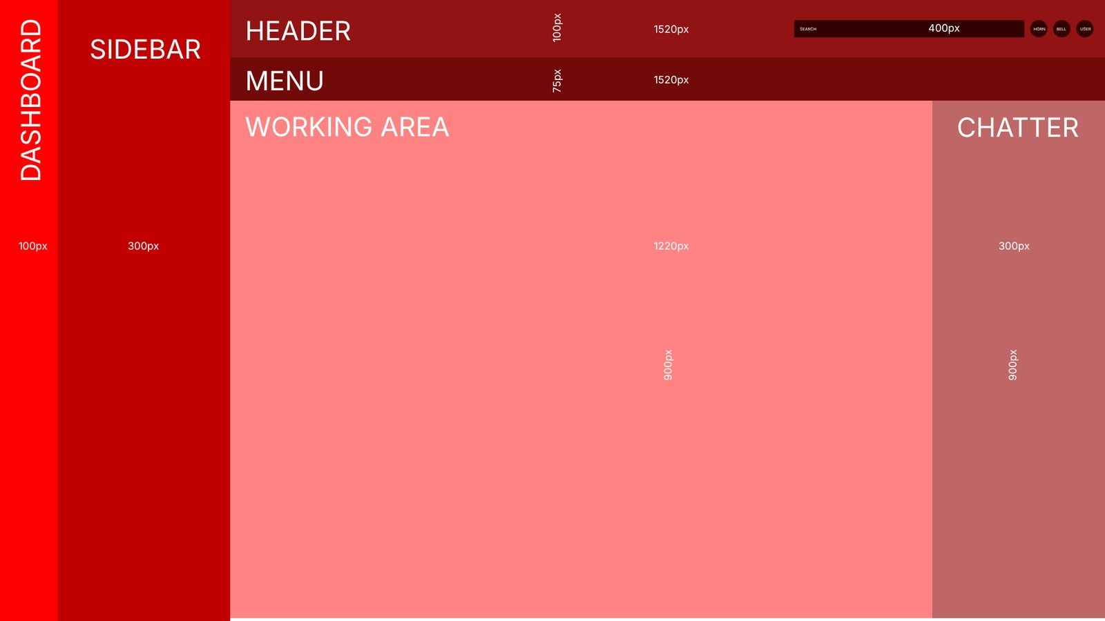
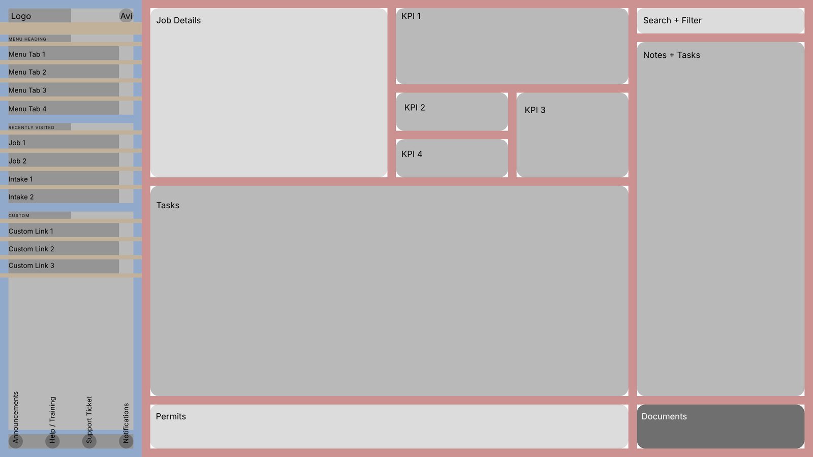
Before any screen, I set the anatomy every page would share: navigation, a header, a working area, and a column for the conversation about the work. Each existing tool was then rebuilt inside it as a feature, sharing one design language, navigation and vocabulary. I came to call these feature-wares.
One workspace per job
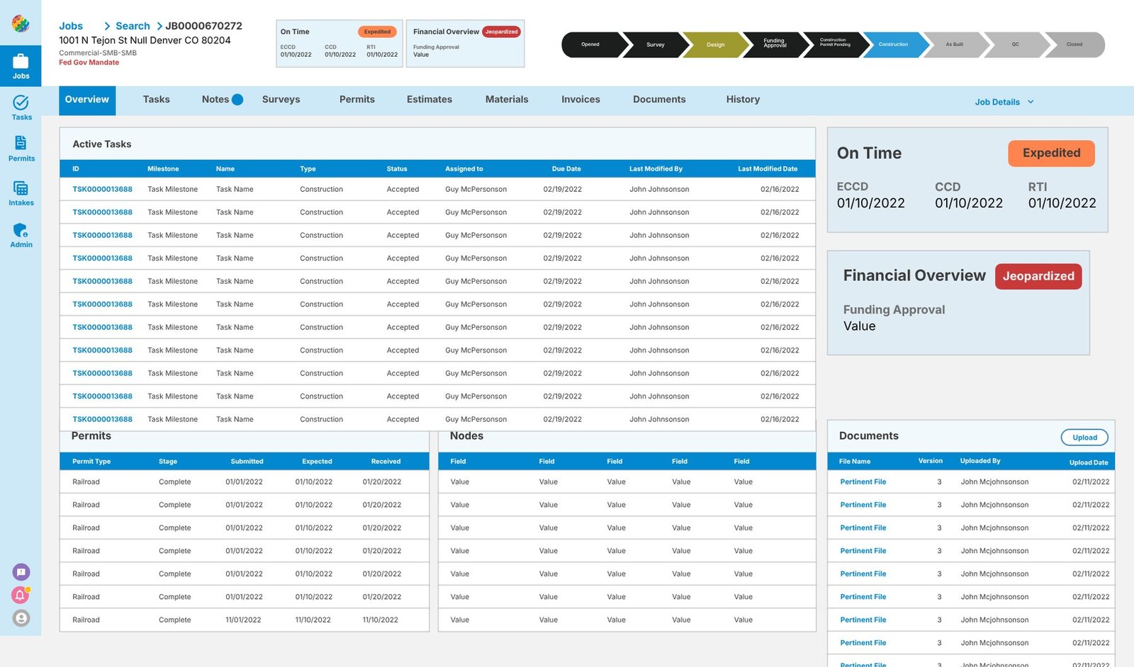
Before, one job was spread across tabs that looked alike. The rebuilt job page gathers everything about a job in one place: where it is in its life, from opened to closed; whether it's on time and on budget; and the tasks, permits, network nodes and documents that belong to it. Each feature-ware, from reconciliation to permitting, lives as a tab on the same job.
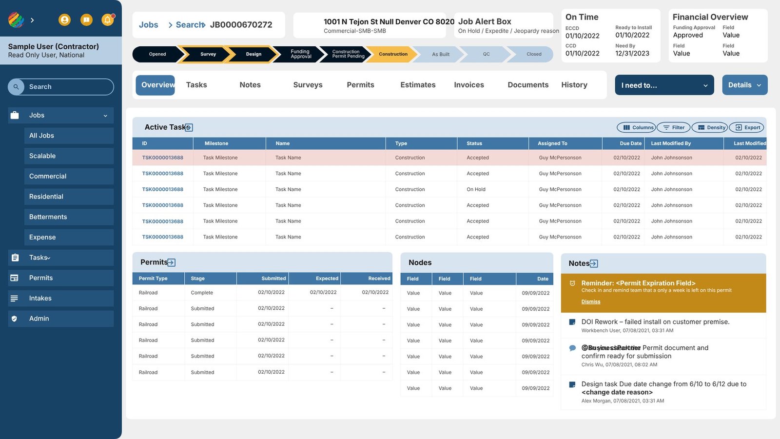
The first version went live internally so people could use it on real jobs. After a year of validation and their input, navigation moved into a sidebar organized by job category, the header gained a job alert box and the dates crews plan around, actions gathered into a single "I need to…" menu, and the job's details folded away until needed.
Conversations in context
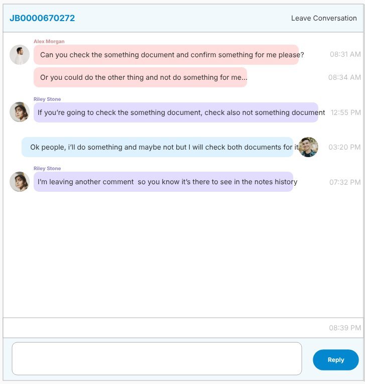
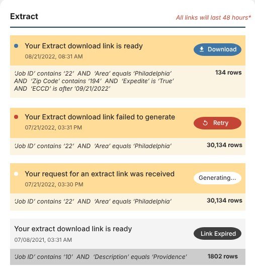
Approvals and rejections used to be argued out in Chatter, inside the Salesforce app, away from the work. I designed job-level conversations so every exchange lives on the job it's about, next to the numbers and documents in question. Notifications followed the same idea: a long data export tells you when it's ready, what it contains, and when its link expires, instead of leaving you to wait on a spinner.
A shared system
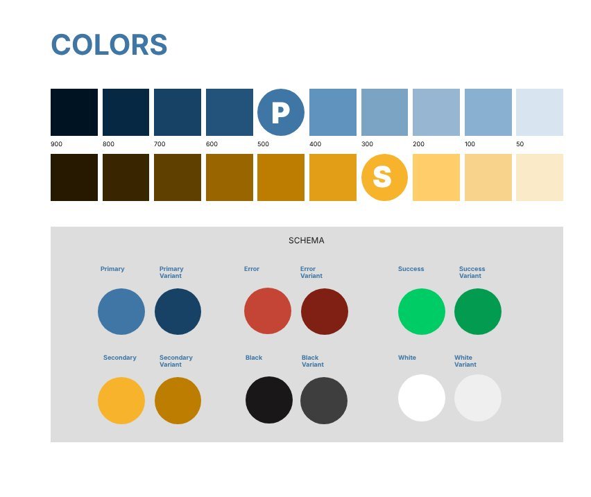
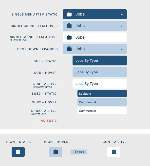
The move to React made a shared system possible. I built a token-based design system used across three applications and one brand across the network products: color scales with named roles, and navigation with every state defined.
The full design system will get its own case study.
Outcomes
- 115,000+
- employees, contractors, and vendors, without per-seat license limits
- $ Millions
- saved in Salesforce license fees that only kept rising, along with the service agreement and the year-end changes that kept breaking things
- 24 → 3 screens
- to approve a work order in reconciliation, and 20+ minutes to under 4, for a finance team of about 50
- ⅔ fewer
- repeat support tickets after Vox launched
- NPS −32 → +32
- for Permitting, after its redesign (approximate)
The division that had built its own app became one of the platform's strongest adopters, and the finance team proposed, adopted, and advocated for Planning's AI forecasts.
What I learned
Change the foundation early, while it's still cheap. The switch to React three months in was the turning point. It felt costly at the time, and it made almost everything that followed possible.
Close the distance to the work. Our products struggled when design was distant from the people using them, and improved when that distance closed. Permitting's first release, designed without direct access to the divisions, is the clearest example. When access is limited, it's worth finding other ways to understand the work: developers, data leads, the spreadsheets teams keep on the side.
Not every idea needs to ship. A mobile app for finance executives didn't gain enough stakeholder support, and after three months of prototyping we set it aside. Network Connections, a full application brought in as a single feature with too few voices shaping it, taught me to widen the room before narrowing the design.
The studies
Planning, Permitting and Reconciliation were feature-wares on the platform, each with its own story. Vox was a separate project I started after seeing the gap left by the 700-page manual that shipped with the original app: people needed a place to actually learn the processes.
- 02 / AI Planning Helping a cautious finance team trust AI-predicted completion dates. Adopted by finance
- 03 / Trust Permitting Rebuilding trust in a tool after a difficult first launch. NPS −32 → +32
- 04 / Finance Reconciliation From spreadsheets no one could count to one view of every job's costs. 24 → 3 screens
- 05 / Community Vox A training site and forum where users learned from one another. ⅔ fewer repeat tickets